A few months ago I stumbled across This Was Our Pact by Ryan Andrews and it was a revelation both stylistically and narratively. The story is wild and imaginative and a joy to read but as with most of the books I dog ear, the illustrations are memorable. In particular, Mr. Andrews uses texture and scale beautifully. There are moments within the layouts where the environment dwarfs our protagonists and becomes a character in its’ own right. Similarly, texture and line quality are used playfully throughout. One scene conveys a starry night sky with abstract circular pastel/chalk mark and in another, delicate thoughtful micron lines show encroaching fog. This Embracing of texture to convey mood is invigorating and after delving a bit deeper (The Iliad, Be Prepared, The Prince and the DressMaker, Fantasy Sports) I’m realizing the Young Adult graphic Narrative market is taking big bold storytelling risks.
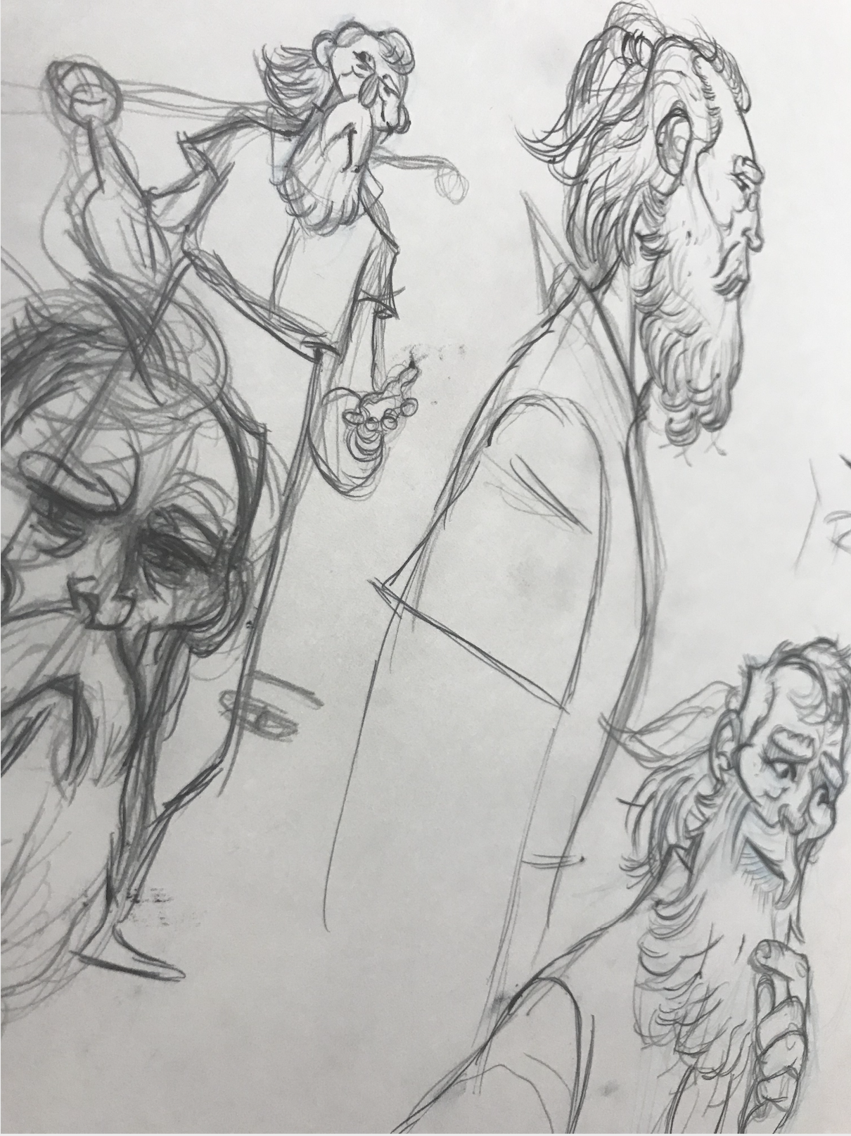
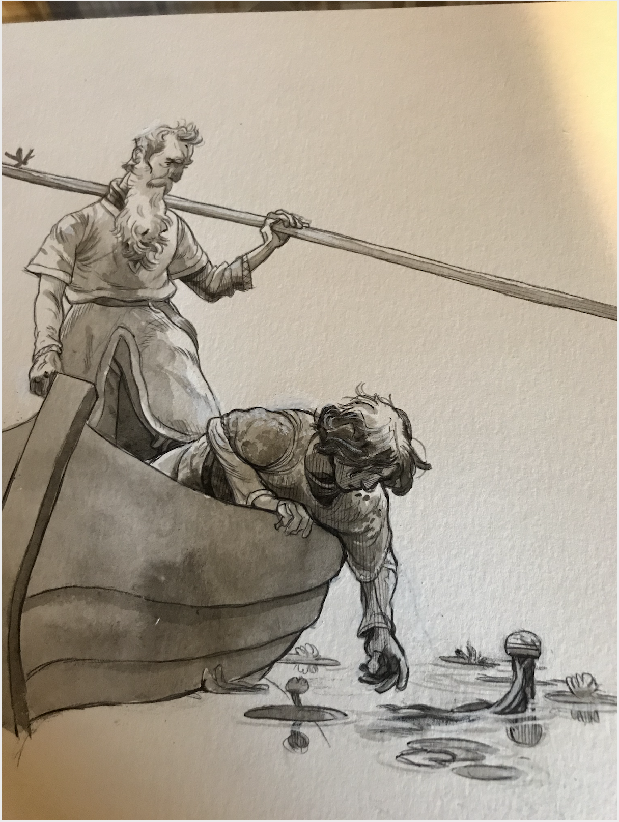
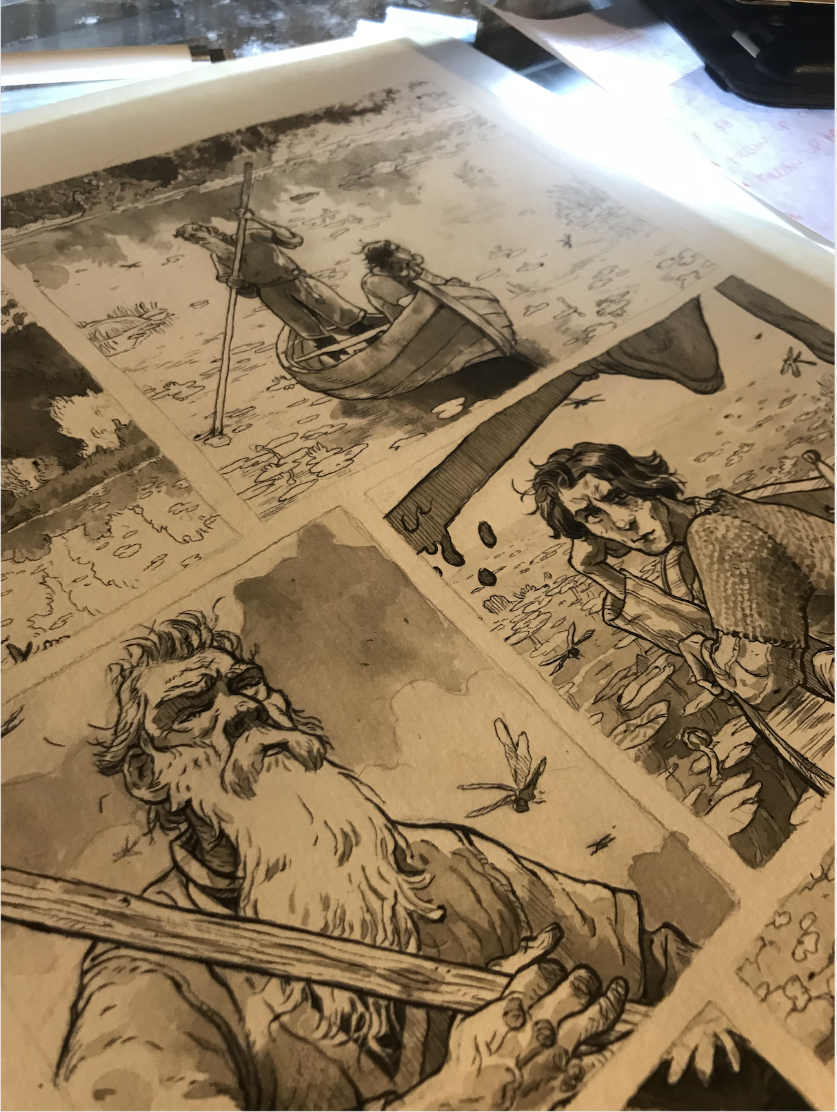
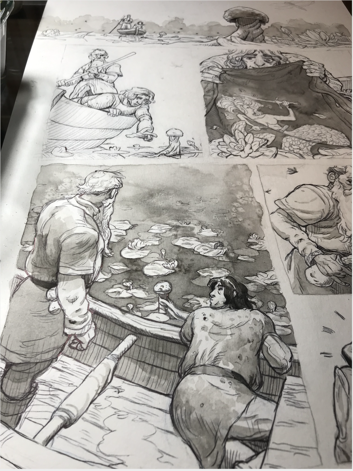
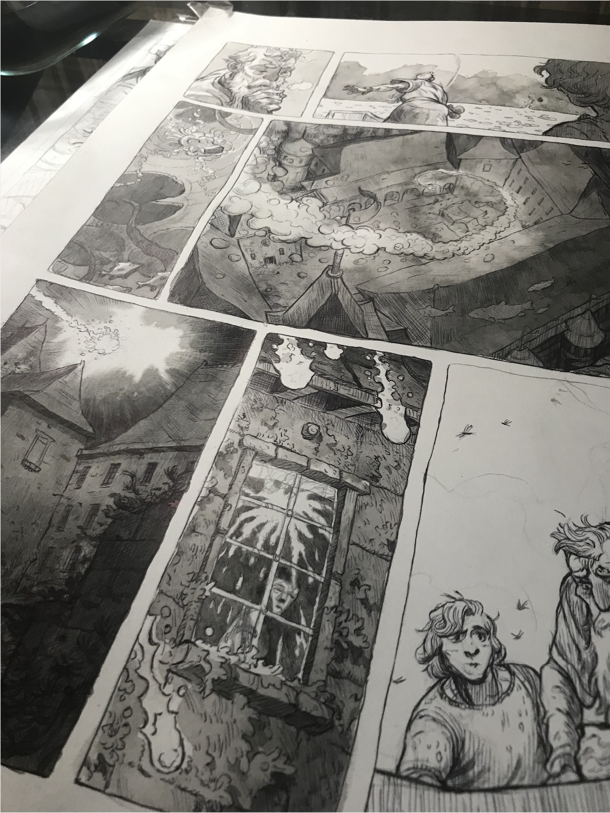
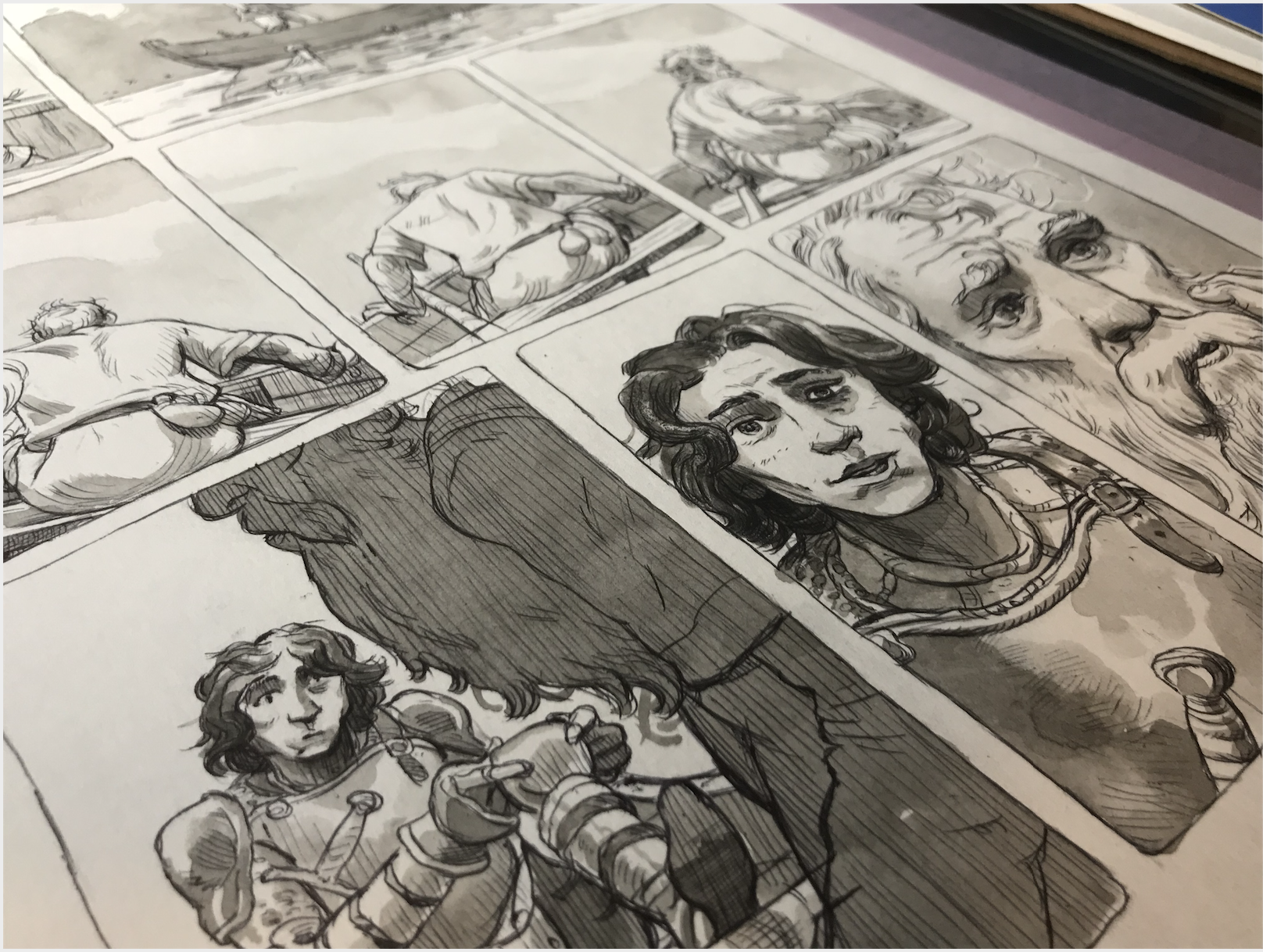
I have always enjoyed showing process in my work (pencil under drawing, ink spatter with washes etc etc.) and This Was Our Pact gives a technical guide on how texture and process (when handled deftly) can add to a narrative. I’m trying my hand at this with a graphic novel pitch of my own, retelling Young Arthur and Merlin’s formulate years and burgeoning friendship. This project will be tackled with tactile tools such as ink wash, ballpoint pen, salt in washes and whatever else comes to mind to showcase the vacillating moods of the Arthurian world.

And a final colored, lettered page.
