When I look at my heroes in the comic book industry, Arthur Adams and Mike Mignola spring to mind. This is the most recent study of Batman after pouring over their work.
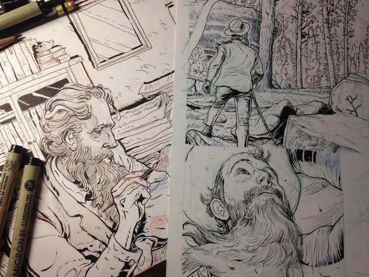
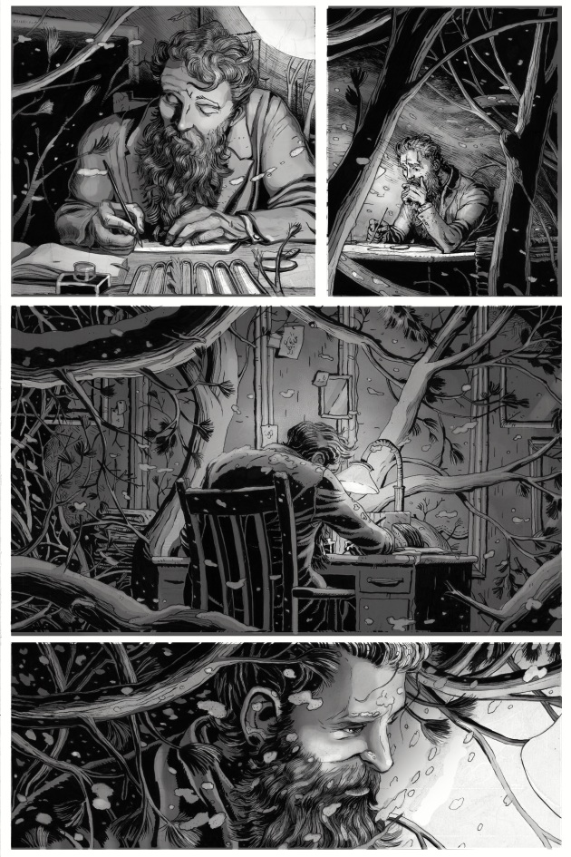
The John Muir comic continues!
5 pages left
HOW Magazine and my workflow
Recently HOW Magazine gave me the chance to talk about comics and my workflow when creating them. Check it out here
Thor's Origin: Comic Art Workflow
Here are my rough layouts, pencil and color for page two of the comic
City of Worlds book cover
Steven Carroll is finishing up his new young adult book and I was lucky enough to help with the cover.
My project with Adobe in an awesome short video
I was recently worked on a project with Adobe Students and Marvel to create a custom comic detailing the Avenger's origin stories to be released at Comic-Con, It's done and was a blast. I learned so much working with Adobe and Marvel and am proud of the work we did. Here is a video and tutorial (scroll down) showcasing everything.
https://helpx.adobe.com/mobile-apps/how-to/sketch-comic-book.html
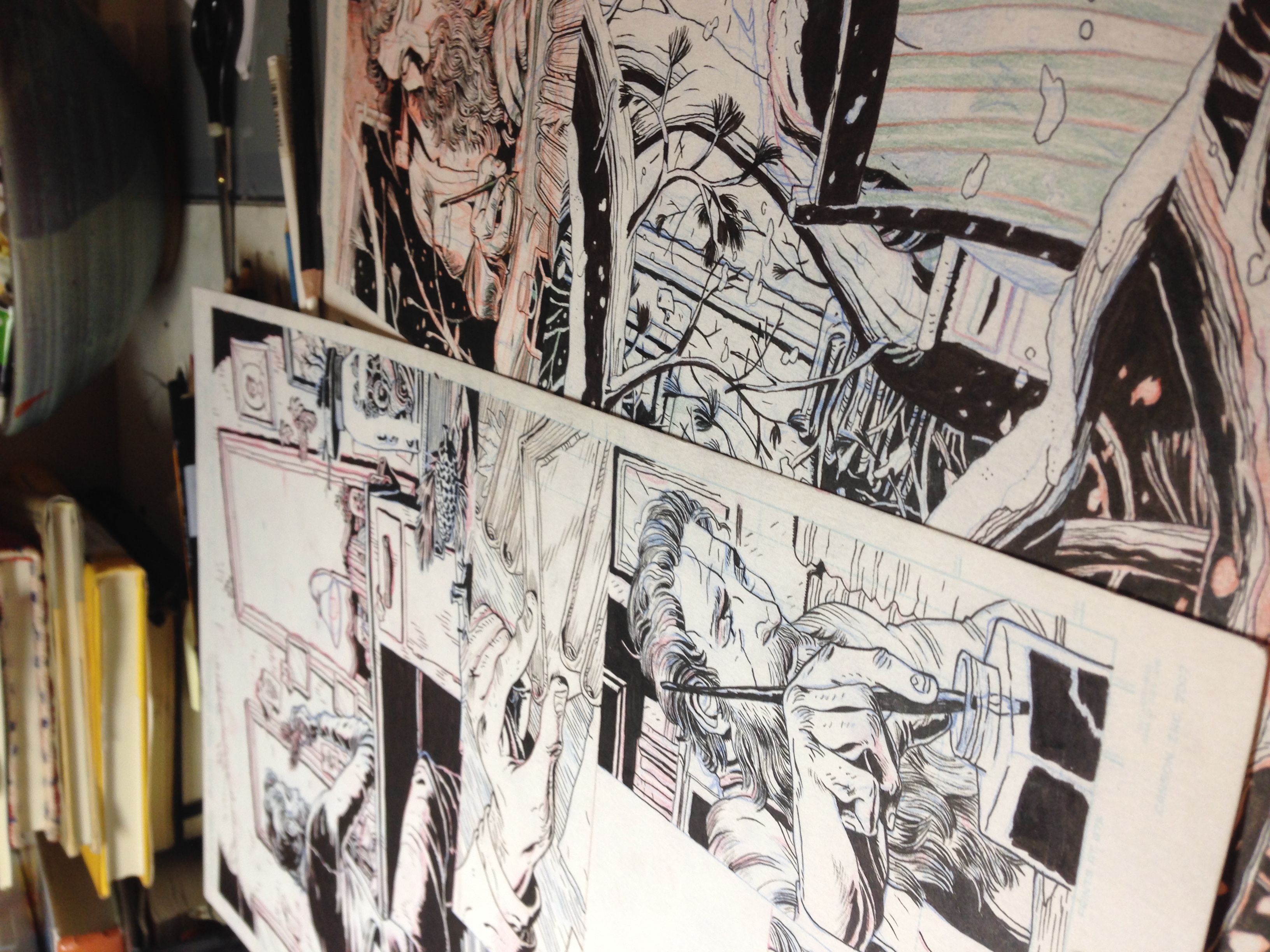
John Muir page 6!
Page 6 for the thesis comic in process
The Invisible Man! ink study.
a quick study inspired by H.G. Well's badassery.
Creative Quarterly 39
Great news! Two of my pieces ( The Mermaid Tattoo and Late Night Halloween ) got into the current issue of Creative Quarterly#39! Check out a preview here. http://cqjournal.com/currentissue
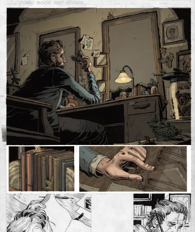
Coloring John Muir
I'm currently coloring a portion of my John Muir comic in prep for San Diego Comic Con (!) and am pretty thrilled with the results. Check out a portion below
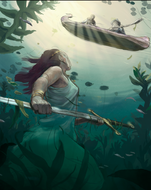
Arthur and the Lady of the Lake in progress
My good friend and talented illustrator David Wilson http://www.downpourcreative.com/, just introduced me to the world of pen touch tablets and its blowing my mind. This is piece is 50 percent done (with a Panda City tablet) and so far I'm having a blast.
Adobe and Marvel and Me!
Recently, Adobe and Marvel teamed up to make a comic telling the origin stories of the super team The Avengers by way of Behance and art students. I entered, and can now officially say I'm one of the four. I don't want to spoil anything but am super excited about my character! Stay tuned to the Adobe Student's Facebook page for updates and previews.
Thesis pages update
Here are the first three pages of the thesis at 75 percent completion along with one color study.
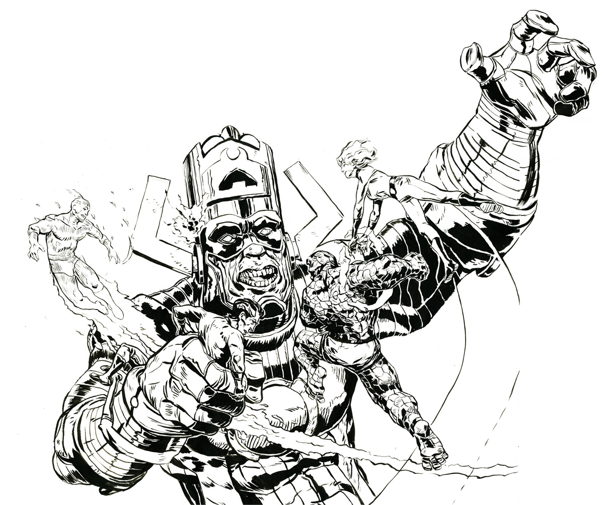
Fantastic Four Ink and Color
Here's a piece illustrating the awesomeness of the Fantastic Four's best nemesis; Galactus! I did this entire illustration based off the idea of what it would look like to squeeze Reed Richards.
Thesis progress
The thesis is under way! and has been for a while. It's a blast and the comic is starting to take shape.
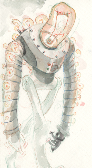
creature Silhouettes
In character design, a big part of developing a captivating character is establishing a unique silhouette. Lots of design principles come into play here such as straight and curved edges, implied line, use of negative space etc and this set of character sketches is meant to get me out of my comfort zone (details) and start thinking about the overall form. I chose the theme "henchmen" because its goofy and super easy to establish an over the top character. Hopefully I'll have the time to flesh more than one of these guys out.
Elephant haircut
Here is an elephant getting an awkward haircut
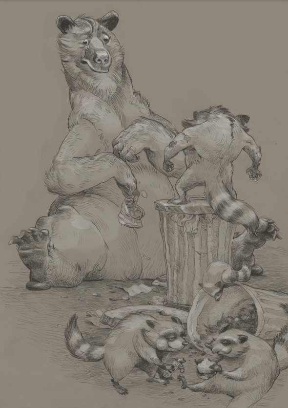
Sensitive bear and pugnacious raccoon.
Here is a piece telling the ballad of the meanest raccoon in the world.
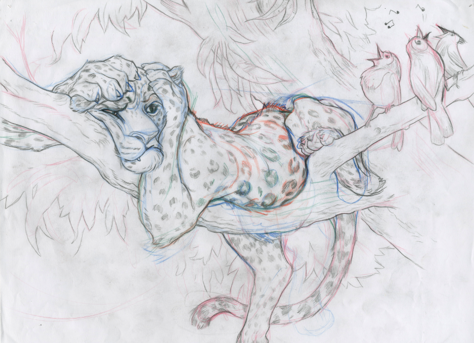
Leopard in Tree character design
Here is a character study of a fed up leopard.
Cheetah character design
Cheetah's are awesome and make for really interesting studies
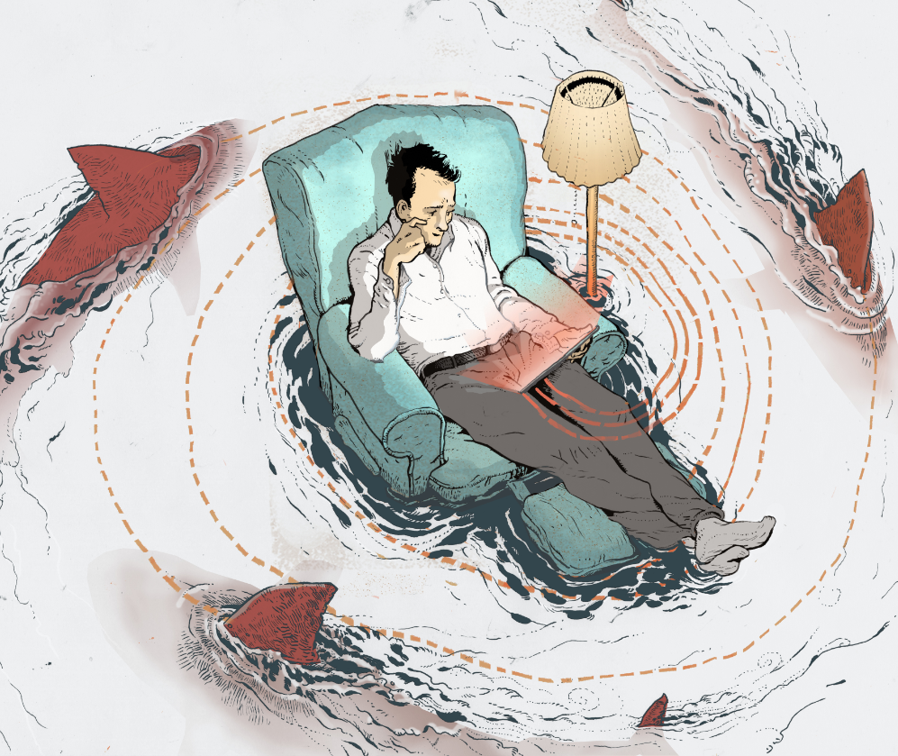
Sharks and wifi third draft
For this piece I stepped away from the traditional colors and tried out a primary color scheme

